
Unusual is not necessarily good.
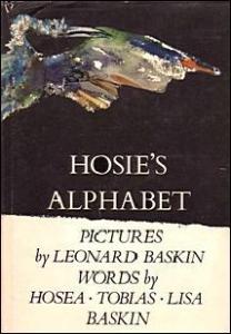
This is a weird book. Every spread is a letter of the alphabet in alphabetical order, picture on the right, text on the left. It starts out like it's almost going for some alliteration, but then it just stops. It's almost like some of the pages go for alliteration, and some of them don't, which I guess makes sense because it was written by different people. I don't know who Hosie is or why he wrote this alphabet. He's not even the illustrator. It's just bizarre, and the illustrations are strange, in a kind of Ralph Steadman way, if Ralph Steadman did watercolor with smudges. They're very dark, almost disturbing illustrations. "D" is for "demon," of all things. Most everything else is an animal or creature of some kind. I guess "P", the "primordial protozoa" is technically not an animal but pretty much everything else is. "U", the "invisible unicorn."
Some of the stuff is just disturbing. "X, the dragon of the alphabet." X is the only one that actually looks like the letter-- a letter X which is growing rainbow colored scales all over, like it's actually some kind of serpent with no legs, wings, or anything, just coiled into the shape of an X. It's very strange. "V, the cadaver-haunted vulture." What? "A scholastic toad." "R, the rhinoceros express." (I don't know what's "express" about that rhinoceros. It looks like he's just sitting there.) "M, a mole in a hole." And then you get, "N, the sweet-throated nightingale at dusk." It's got a rather split personality. There's nothing inherently disturbing about the pictures, but they're so dark and smudged, and the faces are not kind-looking at all. Most are not realistic-looking. Some are more realistic than others, but then you get things like a demon and a carrion crow.
I like what it does with typography. On most pages, the text is about the same size with the same font, but then you get to, "F, a furious fly" and the text is really tiny, or "T, a scholastic toad," and it uses something like a blackletter font.
This is a weird book. I guess it's for people who are fans of the illustrator, Leonard Baskin. He has a very distinctive style and it's different from most other children's books.
Illustrators
Awards
Publication Year
1972
Age Range
n/a
Number of Pages
52
Number of words on a typical page
4
Amazon Link
https://www.amazon.com/Hosies-Alphabet-Leonard-Baskin/dp/0670379581
Goodreads Link
https://www.goodreads.com/book/show/1687523.Hosie_s_Alphabet
Other Links