
The biggest wonder: Why?
This book is about a dog going on a journey around the world to visit what the title calls the "10 World Wonders" but the second page actually calls "The Ten Worldly Wonders." I know this is self-published, but it's pretty clear that either the author of this book did not hire a book designer, or their book designer was terrible. Because when you have poetry, you can't just split the lines wherever you feel like. Lines of verses of poetry need to all be on the same line, which the layout of this book ignores repeatedly. On the second spread, for example, there are eight lines of poetry. The first line has a line break in the middle of it, making it two lines long, and those lines and the next two lines are on the left side of the spread, and the other five lines are on the right side. It's really hard to follow, and it's difficult to figure out what's supposed to rhyme with what, especially because about half of the rhymes are slant rhymes (and not very good ones at that, like "tons" and "alarms" or "resides" and "designs").
The "World Wonders" that it names seem to be chosen almost at random. The Eiffel Tower is very symbolic, but there's nothing amazing about its construction; it's just the symbol of Paris. Then you get some truly wonderful structures, like the Taj Mahal, the Great Wall of China, the pyramids of Egypt, Machu Picchu, Angkor Wat, the Parthenon, and Petra. And the last two, as if he ran out of man-made structures, are the Great Barrier Reef of Australia, and the fricking Northern Lights! Those aren't even in a specific place! Sure, the Great Barrier Reef and the Northern Lights are wonderful, but usually when people make a list like this, they choose either man-made structures or natural wonders.
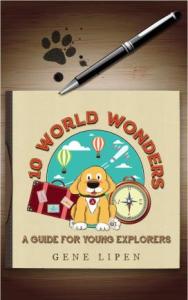
The main character, a dog named Arthur, is depicted in a somewhat arbitrary fashion. Are the lines that make him up shaggy? Smooth? The illustrator can't seem to make up her mind. And the art style varies greatly, with vector graphics in the background on some pages, cartoony graphics on others, and on the Angkor Wat page it looks like she just took a photograph of Angkor Wat and ran it through Photoshop's posterize filter, turning it into an ugly mess. There's no consistency in text or images, and I think the author either needed a better editor, or needed to listen better to the one he had. A lot of the lines could be improved.
It doesn't have a bad message. I'm not really sure it has much of a message at all. It comes across like somebody made this character, Arthur the dog, and wanted to illustrate him in a bunch of locations. Especially because the last two lines of the book are: "This story is ending, but we all can assume,/Another Arthur adventure will be coming soon!" Really? Well, I hope that the next Arthur adventure that comes has a better editor and hopefully a decent book designer, somebody who can help them lay out text in a way that makes sense.
Illustrators
Publication Year
2019
Age Range
Pre-6
Number of Pages
28
Number of words on a typical page
30
Amazon Link
https://www.amazon.com/10-World-Wonders-preschool-Explorers-ebook/dp/B07ST7HC56
Goodreads Link
https://www.goodreads.com/book/show/46222359-10-world-wonders